Renowned across the globe for its remarkable blend of functionality and simplistic beauty, Scandinavian Design has its roots embedded deep in the hallways of Nordic history and culture. Exemplifying the region’s love for simplicity, minimalism and harmony with nature, it’s a design aesthetic that captivates and intrigues. A crucial element in replicating this tranquil allure is the Scandinavian color palette, with its soothing hues reflective of the Nordic landscape. Our exploration commences with understanding Scandinavian Design’s historical roots and core principles, takes a serendipitous journey through a typical Scandinavian Color palette, its utility in interior design, all culminating with the latest trends and innovations in this aesthetic.
Understanding Scandinavian Design and its Roots
Roots of Scandinavian Design
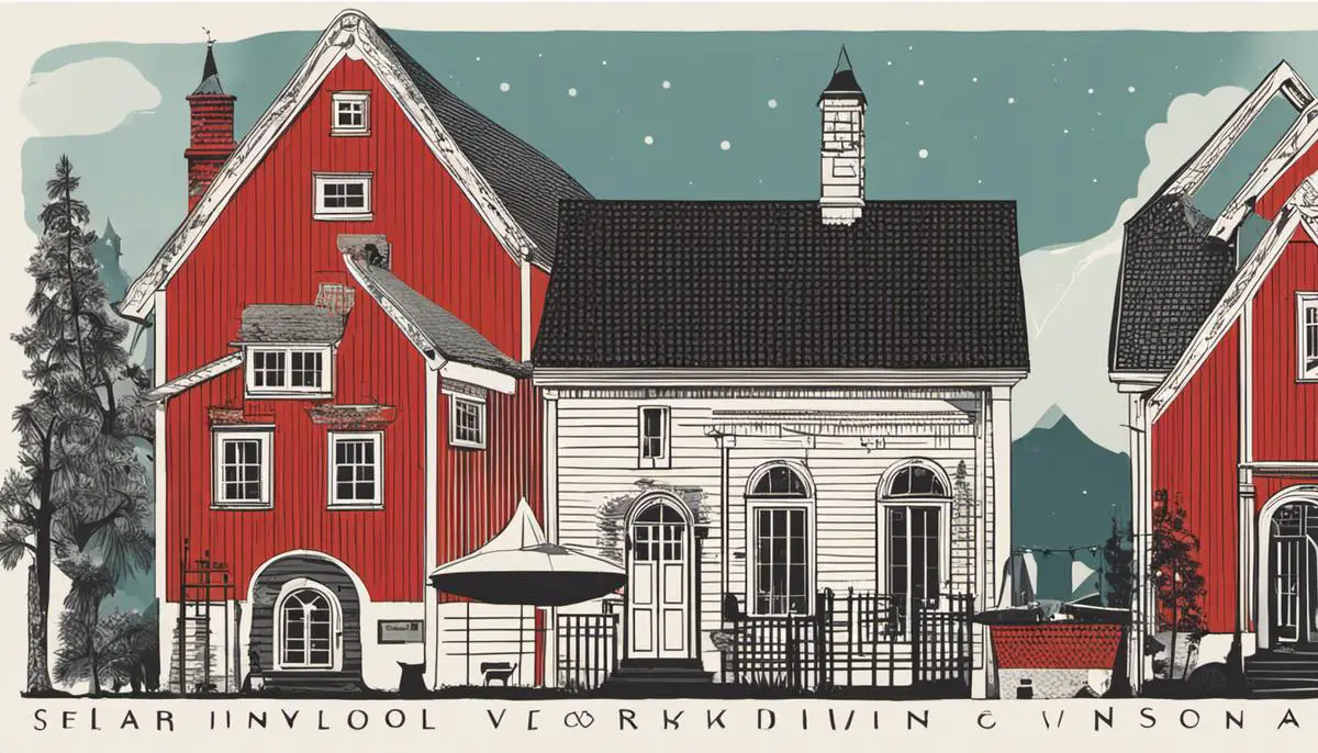
Scandinavian design originated from the five Nordic countries of Denmark, Norway, Sweden, Iceland, and Finland. This aesthetic emerged in the 1950s in response to the harsh weather and short daylight hours in the Scandinavian region. The lack of natural light demanded interiors that maximized brightness and warmth, which remains influential on the color palette to this day. The movement aimed to create simple, functional, and affordable designs that were accessible to all, contrasting the notion of design as exclusive and luxurious.
Elements of Scandinavian Design
Infused with a deep respect for nature and its materials, Scandinavian design often incorporates wood, especially lighter varieties like pine, oak, and ash, along with other natural elements like leather, wool, and stone. Clean, simple lines, organic textures, and minimalistic qualities define its furniture and architectural designs. It emphasizes functionality without forsaking aesthetics, resulting in spaces that are both practical and beautiful.
Scandinavian Color Palette
The Scandinavian color palette is characterized by simplicity, minimalism, and functionality. The traditional palette revolves around calming and muted hues inspired by the natural landscapes of the Nordic region. The most widely used color in Scandinavian design is pure white, used to reflect as much natural light as possible, a necessity in areas with limited daylight. Whites are usually combined with different tones of gray, black, and pastel colors for contrast or a pop of color. If bolder colors are used, it’s typically in a way that echoes the tones found in nature, such as forest greens, ocean blues, or the colors seen in the Northern Lights.
Modern Interpretations
While the classic Scandinavian palette remains popular, modern interpretations have introduced more variety and vibrancy. Today, many Scandinavian designs lean towards playful, saturated colors such as millennial pinks, mint greens, and saffron yellows while maintaining the minimalist and functional underpinnings. However, the use of these colors is still restricted and thoughtfully applied, ensuring they don’t overwhelm the space and detract from the design’s minimalist intentions.
Philosophy of Scandinavian Design
The philosophy behind Scandinavian design is rooted in the socio-political context of the Nordic countries. Known for their strongly egalitarian societies, the design’s primary principle is democratic design, which advocates for beautiful and practical objects that are available to everyone. This principle examines not only the aesthetics of a design but also its cost, availability, and ease of use. The Scandinavian approach views well-designed, aesthetic environments as a means towards a better quality of life, making it a much-celebrated design ethos worldwide.
Scandinavian Design’s Influence on Global Trends
Scandinavian design principles have shaped international outlooks on interior and architectural aesthetics. This design philosophy stems from minimalism and functionality over complicated forms, impacting modern and mid-century modern styles. The Scandinavian color palette is notable for its promotion of light and airy spaces, which has trended open floor plans and incorporation of natural light in architecture. Scandinavian design’s perfect blend of comfort and practicality aligns with today’s needs, affirming its universal appeal and enduring allure.
The Basics of a Scandinavian Color Palette
Grasping the Scandinavian Color Palette
To appreciate the Scandinavian color palette, it’s essential to first comprehend its fundamental traits. The essence of the Scandinavian aesthetic is a blend of subtlety and practicality, marked by neat lines and understated sophistication. The linchpin holding this aesthetic together is the color scheme, which typically emphasizes neutral tones and tranquil pastels, fostering peace and serenity in any surroundings.
Key Colors in the Scandinavian Palette
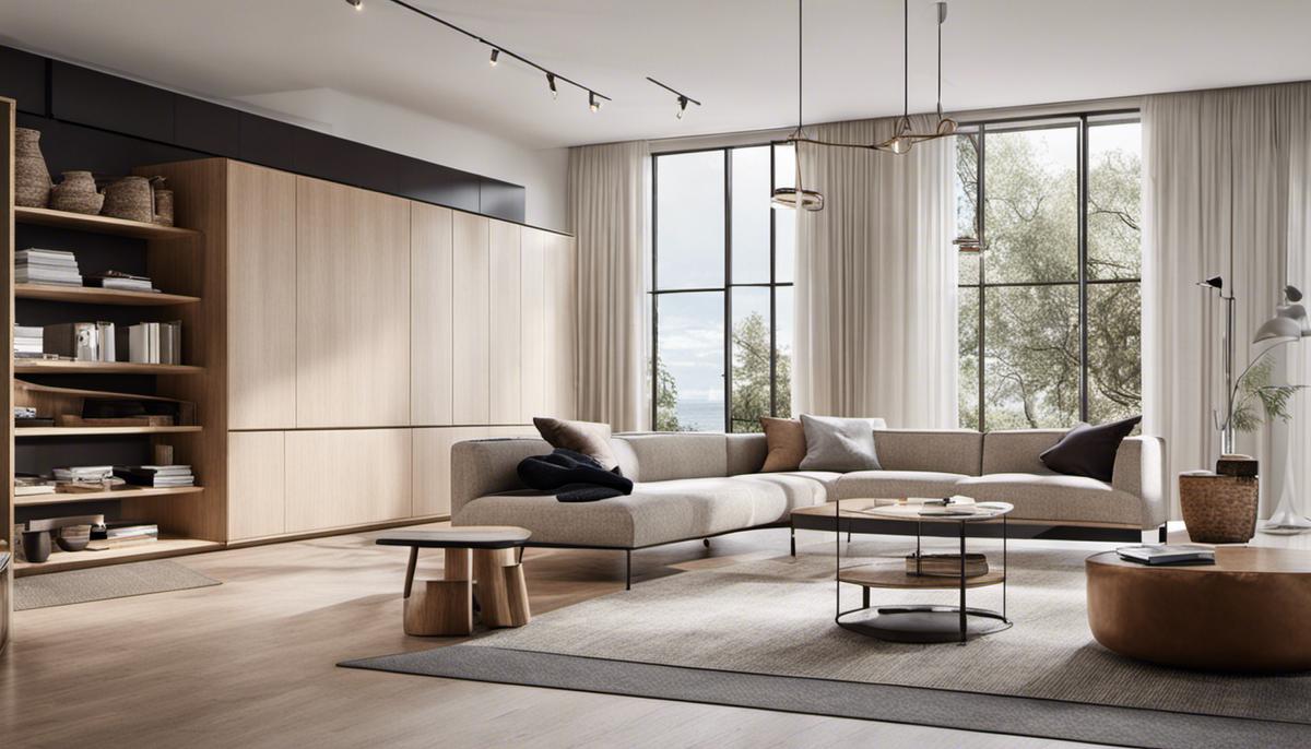
A quintessential Scandinavian color palette includes a handful of key colors – white, grey, black, and pastel hues. The dominantly used color in Scandinavian design is white. This is deeply influenced by the region’s long, harsh winters and short days; creating bright, airy spaces helps combat the seasonal darkness. The broad use of white not only lightens and brightens a space, but it also serves to enhance the other colors in the palette.
Grey and black are also commonly used in Scandinavian design, in various shades and intensities. As contrasting colors to white, they are a great way to create depth and drama in a room without overpowering it. Grey is often used as a secondary neutral, providing a soft balance against the white. Black, on the other hand, adds a strong, grounding element. When used sparingly and strategically, it can add crispness and a modern edge to the overall design.
Complementing these neutrals, pastels are typically incorporated to add a touch of color. Their gentleness aligns perfectly with the Scandinavian love for serene, peaceful atmospheres. Colors like gentle blues and pinks, or soft greens and yellows infuse a space with warmth and personality, without disturbing the balance created by the neutrals.
Exploring the Purpose and Beauty of the Scandinavian Color Palette
The Scandinavian color palette is masterfully curated with each color playing a specific role in establishing a delicate harmony between functionality and aesthetics. Central to Scandinavian design is improving the quality of everyday life through thoughtful design, emphasizing key elements like simplicity, comfort, and pragmatism. The unique colors chosen in this design philosophy are pivotal components in achieving these objectives.
Far beyond their visual allure, the tranquil neutral and pastel colors in the Scandinavian palette have a profound psychological effect. They foster a serene environment that encourages relaxation and general wellbeing. This straightforward palette allows for the spotlight to be placed on essential home features, including plentiful natural light, superior materials, and smart, functional design.
Each color in the Scandinavian palette imparts a distinct character and energy into a space, creating an irresistible, inviting environment oozing style and sophistication. The magic of this color palette lies in its understated elegance, adaptability, and its ability to foster tranquil yet dynamic spaces effortlessly merging form, function, and wellbeing.

Incorporating Scandinavian Color Palettes in Interior Design
Diving Deeper into the Scandinavian Color Palette
In essence, the Scandinavian color palette is an ensemble of cool, serene shades with a dominant presence of whites. It features a diverse range of whites, grays, blacks, and browns. Yet, the palette diverges from this safe spectrum to include bright, natural tones like blues and greens, and even dashes of lighter pastels to inject contrast and visual interest. The result of these carefully selected colors achieves the iconic minimalistic, yet warm and welcoming feel characteristic of Scandinavian design.
Influence on Room Ambiance
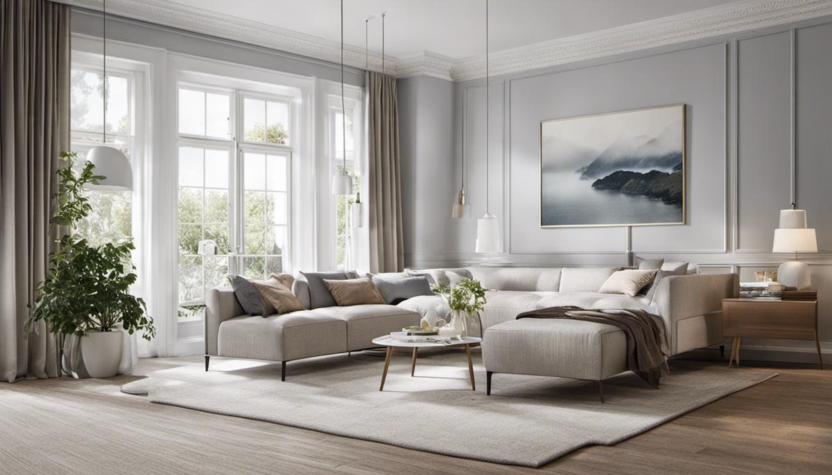
The choice of Scandinavian color schemes significantly impacts the overall ambiance of any room. Cool white walls and light-colored furniture pieces reflect natural daylight, creating a bright and airy environment. Black, meanwhile, adds depth and drama when used sparingly, for instance in certain accessories, while varying shades of gray can bring a soothing and calm effect, ideal for spaces where comfort is key, like bedrooms.
Practical Tips on How to Apply Scandinavian Color Palettes
If you’re keen on incorporating the Scandinavian color palette into your home, start with a base of white for the walls. This will act as a canvas allowing more room for playing around with different color elements. Shades of gray can then be introduced by way of furniture or décor to add depth and design layers. Make use of natural light as much as possible, as it enhances the crispness of the white and brings a remarkable luminosity to the room.
In adding color accents, opt for softer and calming tones that mimic natural elements. Consider light blues to reflect the sky, different shades of green to represent nature, or even light pink to add a touch of warmth and comfort.
Color Pairing in Scandinavian Design
Balance and harmony are important principles in Scandinavian design. When it comes to pairing colors, remember to keep it simple and unified. Light colors such as pale blues, soft pinks, and various tones of white often go together well to achieve a calm and relaxing room environment.
On the other hand, adding touches of dark colors such as black, deep grays, and chocolates can create interesting contrasts without overwhelming the room. An example could be a black statement chair in a predominantly white room or maybe dark textured throws and pillows on a light-colored sofa.
Where and When to Use Certain Colors
Choosing where to apply certain colors in your home depends on the type of ambiance you want to create. The bedroom, for instance, would benefit from calming grays, creams, and whites, fostering a relaxing environment for sleep.
Living areas, on the other hand, can withstand bolder hues of blues or greens to create a lively, welcoming space. These color elements can be introduced through art pieces, pillows, throws, or small furniture pieces.
Meanwhile, kitchens and bathrooms speak well to the most typical Scandinavian style: crisp white walls, paired with black or gray accents. This setup exudes a clean, posh and modern feeling enhanced by the simplicity of the design.
Remember that the fundamental objective of Scandinavian design is not to overwhelm every space with vibrant color, but to establish a chic, functional, and harmonious look that perfectly blends style with practicality.
Refreshing the Scene: Recent Trends and Innovations in Scandinavian Color Palettes
Development of Scandinavian Color Palette
Known for their simplicity, the Scandinavian color schemes have always preferred softer, neutral hues. These are commonly inspired by the natural beauty of Sweden, Norway, and Denmark, highlighting clean whites, calm grays, and cool blues. In recent times though, the classic Scandinavian palette has seen an evolution. It now welcome bolder and brighter hues, while maintaining its signature minimalistic style.
Modern Combinations in Scandinavian Design
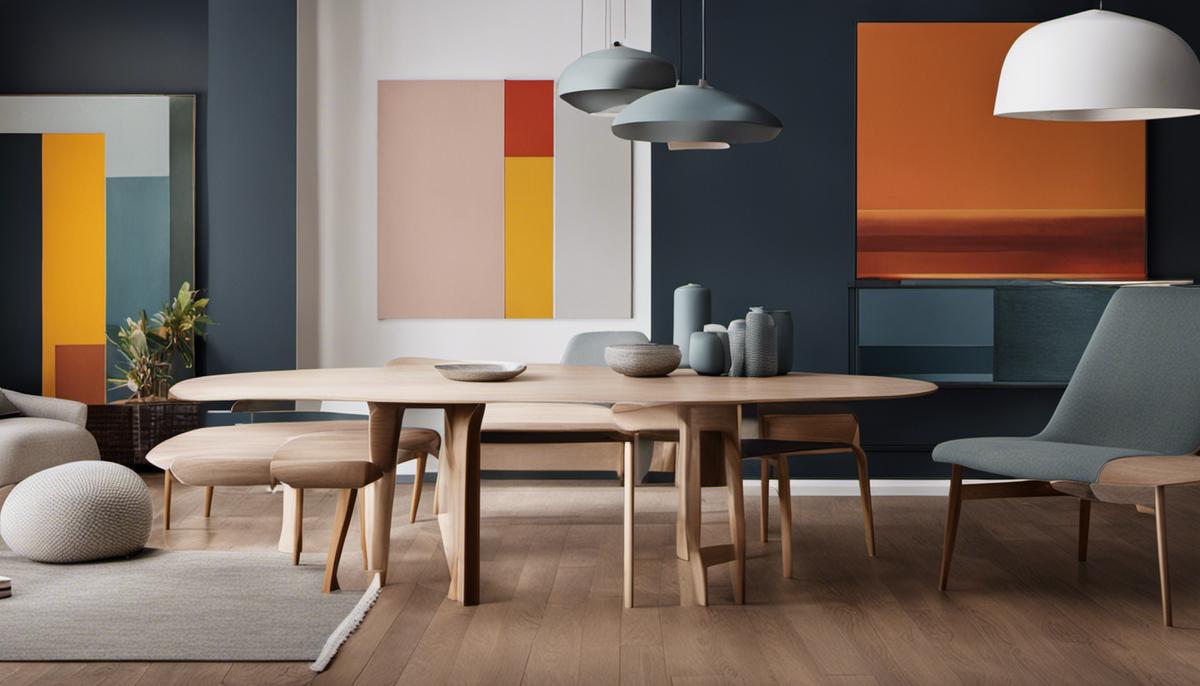
Recently, there’s been a shift in the color combinations used in Scandinavian design. Muted pastels have come into the fold, with soft pinks, greens, and yellows offering a gentle contrast to the traditionally favored grays and whites. The use of these pastels is both refreshing and innovative, providing a pop of color without being overwhelming – thereby maintaining the serene and calming ambiance so typically associated with Scandinavian design ideologies.
Alternatively, rich hues like deep blues, greens, and even blacks have also been incorporated, offering dramatic and bold contrasts. However, these colors are often applied sparingly to maintain a balance with lighter tones and keep the overall palette harmonious and visually soothing.
Bold Hues and Innovative Color Arrangements
While neutral tones and calm pastel shades continue to dominate, there’s been a distinct move towards bolder hues in Scandinavian design. Rich jewel tones, dramatic blacks, and deep blues have been introduced to create striking contrasts. These bold colors are often used as accent colors, contrasted against a neutral backdrop to ensure the overall look still leans towards the understated and minimalist aesthetic.
The introduction of these bolder colors does not imply a departure from traditional Scandinavian design principles. Rather, they breathe new life into the minimalist design through innovative color arrangements. For instance, black might be used as a bold backdrop, allowing softer hues and natural materials to stand out. Or a deep blue might be interwoven with gray and white to create a calm but visually engaging space.
Despite these bold new innovations, the true essence of Scandinavian color palettes remains the same.
The overall design aims to promote a relaxing and serene atmosphere that is closely connected to nature. These recent trends only add more layers of complexity and interest to the cherished Scandinavian style while still adhering to its foundational principles of simplicity and functionality.
The enchantment of Scandinavian Design lies in its ability to create an ambiance of serene comfort through simplicity and functionality. The use of a carefully selected color palette, comprising of primarily soft, neutral hues and exciting modern combinations, is central to creating this unique aesthetic. As we have seen, the principles of this design and its signature color palette can be harnessed in a range of home interiors for a minimalistic, yet warm and inviting look. Furthermore, the continuous evolution seen in Scandinavian design trends ensures there is always a fresh, innovative interpretation waiting right around the corner, giving you the liberty to experiment and create your personalized corner of Nordic tranquillity.


Leave a Reply