Engaging the senses and eliciting emotion, color is one of the most powerful elements we can implement in our living spaces. Every hue sends a message, affecting our moods, influencing our thoughts, and even altering our sense of space and light. It serves us well to unravel the complex psychology of color, understand its visual language, and know how to select pertinent shades for our room based on factors such as the space’s purpose, size, and lighting condition. As we delve into this fascinating realm, we will also navigate the latest color trends and styles in interior design, helping us to thoughtfully incorporate such trends into our personal spaces while echoing our distinctive aesthetics.
It’s important to understand that colors don’t just beautify a room; they also have a profound impact on our emotions and mood. Different colors stimulate different parts of the human brain, leading to a range of emotional responses. Psychologists and interior designers alike use this knowledge to their advantage in creating spaces that promote specific moods or emotions.
For example, blue represents serenity, stability, inspiration, or wisdom. Thus, it’s often used in bedrooms or offices where calmness or mental focus is required. Conversely, red is often associated with intensity, passion, or urgency, making it suitable for a vibrant living room or dining area that invites conversation and collaboration.
Color Theory in Room Design
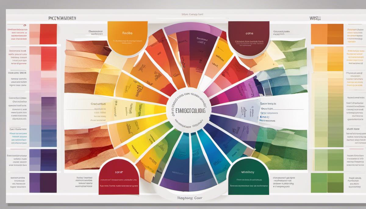
Color theory is a conceptual framework used by designers to understand how different colors relate to each other and how they can be combined to create aesthetic appeal. The color wheel, divided into warm (red, yellow, orange) and cool (blue, green, purple) hues, serves as a fundamental tool in color theory.
One popular approach in room color design is the use of complementary colors, i.e., colors that lie opposite each other on the color wheel like blue and orange or red and green. This contrast can create a dynamic and lively atmosphere. Another principle is the use of analogous colors – colors that are adjacent to each other on the color wheel, such as greens and blues. Using these colors can produce a more harmonious and calming room environment.
Colors and Their Typical Associations
Every color carries specific associations and connotations, dictated by cultural, societal, and even individual perceptions. Understanding these associations is key to manipulating room atmosphere.
For instance, green, being the color of nature, is often associated with peace, tranquility, and rejuvenation, making it a frequent choice for bedrooms or study areas. Yellow, the color of the sun, signifies joy, optimism, and energy, an ideal choice to infuse a room with cheeriness. Conversely, the color black may imply sophistication and formality but can also be associated with mourning or mystery.
Using Color to Influence Room Ambiance
Understanding the purpose of the room you’re designing is pivotal as it helps shape the atmosphere with adequate color choice. For a serene area like a bedroom, relaxing colors such as blues or greens can mirror tranquility. In contrast, warmer colors like yellows, oranges, or reds may be apt for livelier spaces such as kitchens or living rooms.
It’s important to note that darker shades can create a sense of intimacy and make vast rooms feel more homely. On the other hand, using lighter colors can lend a sense of spaciousness and make small areas seem a bit larger.
Grasping color psychology, color theory, and common connotations of certain hues is key to room color design. With a proper understanding and use of colors, you can create atmospheres that align with the room’s purpose and evoke desired emotions.
Choosing the Right Colours for Your Room
Tailoring Room Colors to Personal Taste
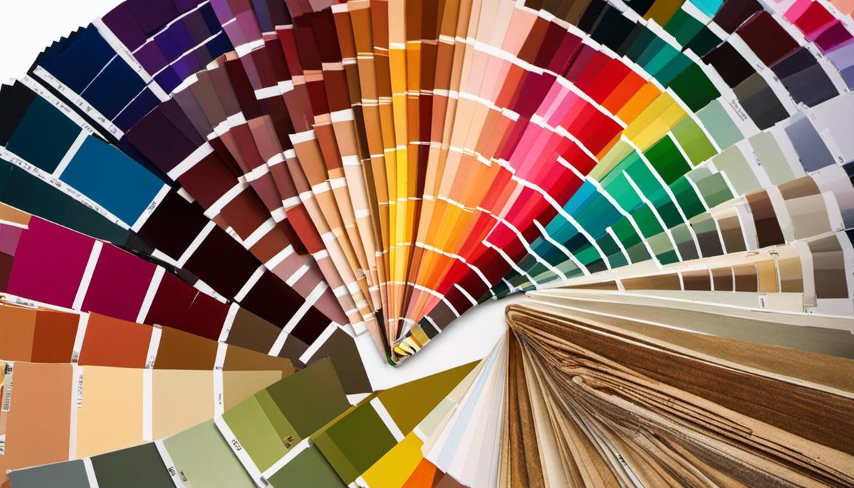
Choosing room colors is often a personal decision, and it’s important that the color scheme of a room reflects the tastes of those using the space most frequently. Your favorite colors and the sensations they induce should always be taken into account. For instance, if the cool shades of blues and greens with their inherent calming effect appeal to you, consider using them. Alternatively, if the energetic vibes of reds and yellows resonate with you, they might make a suitable choice for your space.
Room Size and Color Choices
The size of your room also plays a significant role in color choice. Light and neutral colors often make a small room appear larger and more spacious, while dark colors can lend a cozy, intimate feel to larger rooms. If your goal is to enhance a sense of space, consider pastels, whites, or colors like soft grey and pale blue. Conversely, if you want to make a large room feel more enclosed, consider warm colors or darker hues.
Color Selection Based on Room Purpose
Different colors can elicit varying emotional responses, so it’s essential to consider the room’s intended use. For example, bedrooms typically benefit from soothing colors to promote relaxation and sleep, such as muted blues, greens, or even soft purples. Living rooms and kitchens, often used for gathering and socializing, can handle brighter, bolder colors that stimulate conversation, such as red or orange.
Harmonizing Colors
When planning your color scheme, think about harmonizing colors. These are colors that sit next to each other on the color wheel and share a common hue—like blue and green or red and orange. A room designed with harmonizing colors creates a soothing and cohesive look.
Contrasting Colors in Room Design
Contrasting colors—those opposite each other on the color wheel, such as blue and orange or red and green—create visual interest and energy in a room. They make each other appear brighter and more intense. Use them sparingly and consider featuring one as a dominant color and the other as an accent to create a balanced look.
Using Color to Influence Perceived Space and Light
You can manipulate a room’s perception of space and light through your color choices. Light colors reflect more light, making a room feel brighter and larger, while dark colors absorb light, making rooms feel smaller and more intimate. There’s a theory known as ‘advancing and receding colors,’ where warm colors (reds, oranges, yellows) appear to come towards you, making a room feel more cozy, and cool tones (blues, greens, purples) seem to recede, making a room feel larger.
The Role of Lighting in Room Color Design
Last but not least, lighting significantly impacts how a color looks in your interior space. Natural light will show the truest color, while incandescent lighting will bring out warm tones and yellows. Fluorescent light, on the other hand, casts a sharp blue tone. Therefore, always test a color under various lighting conditions before settling on it. Try out paint samples on different walls and observe how they change throughout the day.
Color in interior design is a matter of personal preference, and it’s essential to understand that what works in one space may not resonate with another. Personal taste and instinct often reign supreme, helping to shape a design that accurately reflects your unique personality. It’s crucial to consider all aspects of your space to craft an environment that truly feels like a representation of you.
Colour Trends and Styles in Room Design
Trending Colors in Today’s Interior Design Scene
In the realm of interior design, recent years have seen a dramatic shift towards the use of bold, vivid colors. Homeowners and designers are stepping outside their comfort zones, incorporating a spectrum of shades from intense reds to rich emeralds, once thought to be too audacious for home interiors. Conversely, the appeal of minimalism remains unyielding. The use of neutral shades such as whites, beiges, and various tones of grey continues to be popular for creating spaces that evoke a sense of tranquility and peace.
Popular Color Schemes
When it comes to popular color schemes, we’re seeing a balance between the traditional and the novel. Monochromatic color schemes, which involve the use of different shades, tones, and tints within a specific hue, remain a classic choice. Complementary color schemes, incorporating colors located opposite each other on the color wheel, are also favored for their bold contrast. On the more innovative front, the use of analogous color schemes (colors located next to one another on the color wheel) is picking up steam.
Emerging Color Trends for Different Rooms
In the realm of room-specific color trends, homeowners are utilizing color to create distinctive spaces that reflect the room’s function. For example, in bedrooms, blue hues—known for their calming effects—are popular. In kitchens, warm whites and soft grays are often chosen for their clean, polished appearance. Home offices increasingly feature dark, moody colors like deep greens or blues that promote focus and minimize distraction.
Incorporating Trends with Personal Style
While trends can serve as an inspirational guide, it’s essential that any color choices also reflect personal taste and lifestyle. For instance, someone attracted to the vibrant color trend but also values a more neutral space could introduce bold colors through accent pieces like throw pillows, rugs, or artwork.
Influence of Design Styles on Color Preferences
Different design styles also influence color choices in homes. For instance, Scandinavian design favors neutral and pastel colors, creating a stark, minimalistic look. In contrast, Bohemian styles relish in the use of rich, vibrant colors and patterns. Meanwhile, Traditional style embraces dark, warm colors, and Industrial design often uses a blend of neutral tones and raw, unfinished hues.
The Impact of Gender, Age, and Culture on Color Preference
Color preference is deeply personal and can be influenced by many factors, including gender, age, and culture. For instance, blue is often recognized as a favorite color among both genders, but women sometimes prefer softer hues, whereas men often lean towards bolder ones. Color preferences can also change with age. Cultural background plays a role too, as certain colors may carry different symbolic meanings or traditions in various cultures.
Overall
When it comes to color design, there are ample ways to creatively and effectively utilize current trends. However, striking a balance between these trends and personal style, lifestyle, and other influences is key to ensuring a space is both fashionable and inspiring.
Linking our understanding of color psychology with the prudent selection of colors for our rooms, we can create spaces that superbly mirror our style, offer the desired mood, and even subtly guide ourselves and others’ perceptions of light and space. Navigating the latest trends in room design, we can add a touch of modernity and freshness. However, always remember – color design is far from being about slavishly following trends; instead, it’s more about understanding these influences and adapting them to suit our personal aesthetics. By conscientiously doing so, we can revel in spaces that are not only visually appealing and on-trend but also feel deeply our own.
We use technologies like cookies to store and/or access device information. We do this to improve browsing experience and to show (non-) personalised ads. Consenting to these technologies will allow us to process data such as browsing behaviour or unique IDs on this site. Not consenting or withdrawing consent, may adversely affect certain features and functions.
Functional
Always active
The technical storage or access is strictly necessary for the legitimate purpose of enabling the use of a specific service explicitly requested by the subscriber or user, or for the sole purpose of carrying out the transmission of a communication over an electronic communications network.
Preferences
The technical storage or access is necessary for the legitimate purpose of storing preferences that are not requested by the subscriber or user.
Statistics
The technical storage or access that is used exclusively for statistical purposes.The technical storage or access that is used exclusively for anonymous statistical purposes. Without a subpoena, voluntary compliance on the part of your Internet Service Provider, or additional records from a third party, information stored or retrieved for this purpose alone cannot usually be used to identify you.
Marketing
The technical storage or access is required to create user profiles to send advertising, or to track the user on a website or across several websites for similar marketing purposes.
This site may contain links to affiliate websites, and we receive an affiliate commission for any purchases made by you on the affiliate website using such links.


Leave a Reply